Thinking of a place that had decent aerial perspective, I thought about the countryside and rolling hills with layers building up to create a sense of the foreground, middleground and background, and considered the Yorkshire moors. With the exercise criteria the three areas to concentrate on were colour saturation, controlled loss of focus and colour temperature.
After mapping the main areas out in a linear study, I then went onto produce both a tonal study and a colour study to get a rough idea of the colour temperature and colour saturation which were a great help in the next step of the exercise.
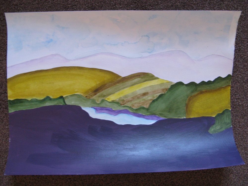
The photograph below shows my final painting for this exercise, and as this was an exercise I didn’t pay much attention to the medium that I was using and chose watercolour and acrylic. However, I am not happy with the outcome, not that it does not show aerial perspective, but because it looks like a rushed colour study, rather than a painting, and so I want to produce another painting of this landscape using oils, where I will be able to experiment with blended and creating smooth layers of rolling hills.
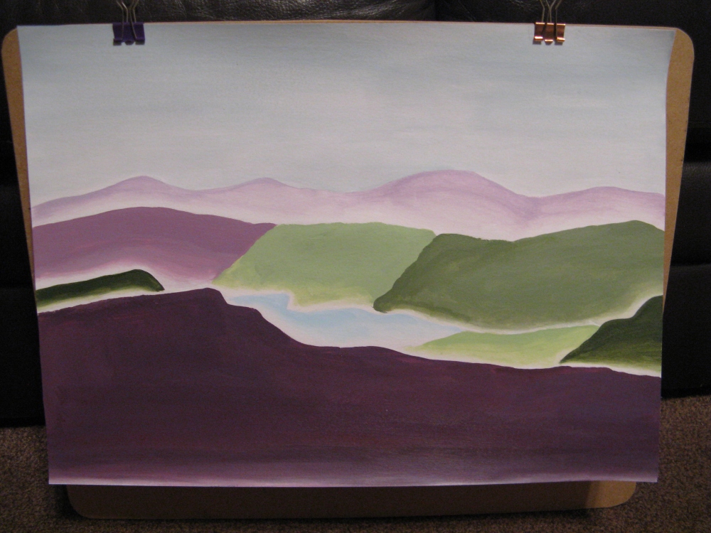
When talking to my tutor, we agreed that the colour combinations did not really work aesthetically, and clashed within the aerial aspect of the piece, and so I decided to create another simple aerial piece using blocks off colour, but this time choosing colours that coordinated with each other to create layers in the landscape. As shown below, I used colours mixed with white in order to create the same tone in the piece, and faded the edges of the fore, middle and background in order to create the layers of an aerial perspective landscape.